결합된 컴포넌트 제작
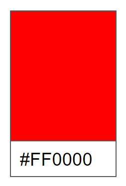
팔레트 카드 만들기
팔레트 카드(특정 색을 확인할 수 있는 작은 사각형 카드)라는 간단한 예제를 이용해서 여러 컴포넌트가 결합된 형태를 구현할 예정이다. 간단한 예제이지만, 두 단계의 체계적인 접근방법을 이용해서 만들어보자.
- 주된 비주얼 요소의 식별
- 컴포넌트가 돼야 할 대상의 선별
주된 비주얼요소 식별
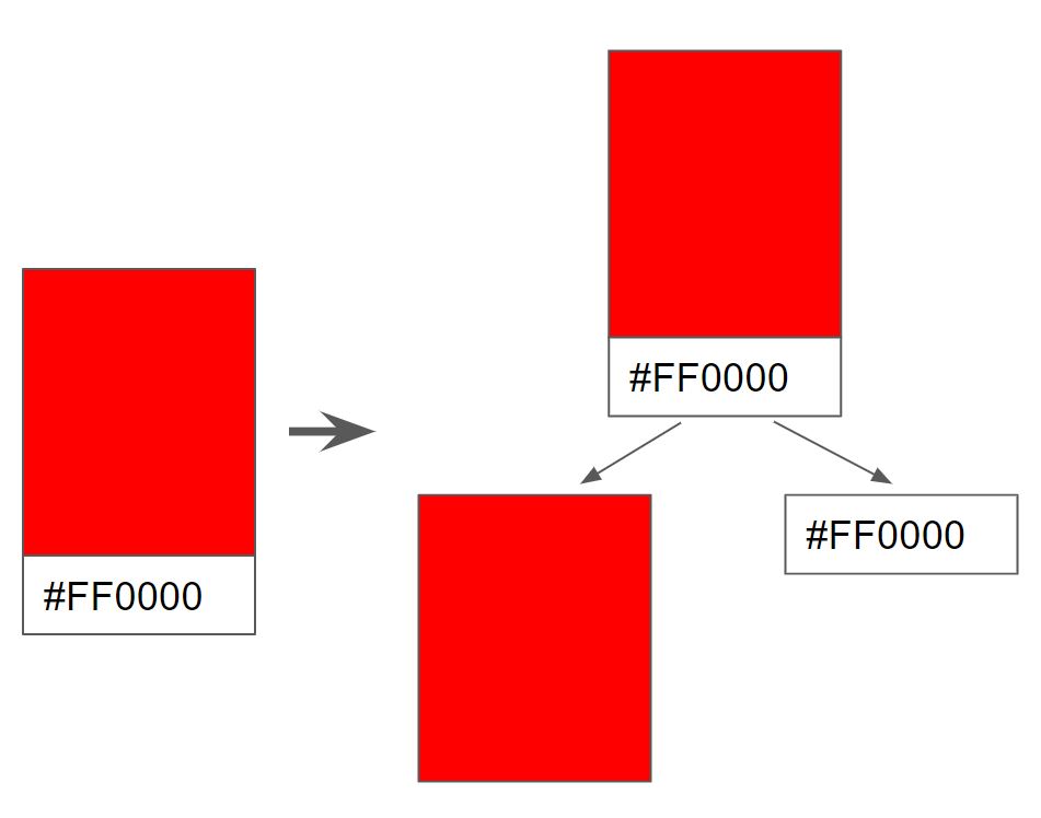
첫 번째 단계는 모든 비주얼 요소를 식별하는 일이다. 식별하는 방법으로는 명확한 비주얼 요소부터 시작해서 덜 명확한 요소로 진행하는 것이다.
첫 번째로 보이는 요소는 카드 그 자체이다.
그리고 카드 안에는 컬러를 보여주는 상단 영역과 컬러의 16진수 값을 보여주는 하단 영역으로 구분된다. 이것을 트리 구조로 배치하면 아래의 그림과 같다.
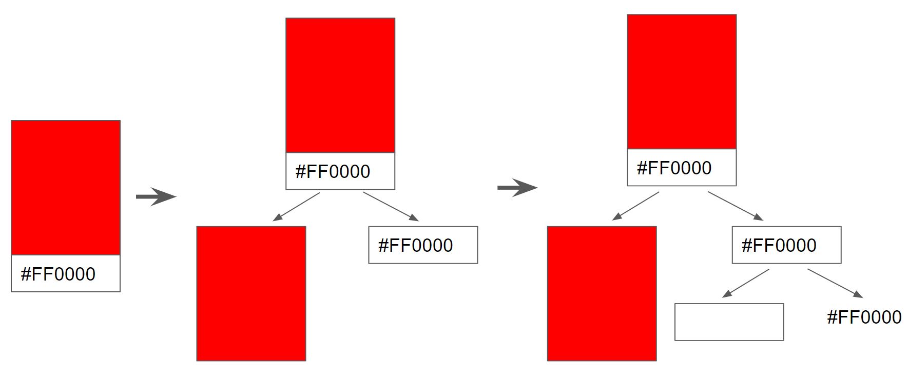
계속해서 나누어보면 하단 영역은 흰색 영역과 16진수 값으로 분리될 수 있다. 더 이상 나눌게 없으므로 최종형태는 아래와 같다.
컴포넌트 식별
컴포넌트 식별에서 모든 비주얼 요소를 컴포넌트로 만들 필요는 없으나, 극도로 복잡한 컴포넌트 몇 개만 만드는 것도 좋지않다. 컴포넌트로 만들 비주얼 요소를 선별하는 기법은 한 컴포넌트는 한 역할만 해야한다는 규칙이다. 컴포넌트가 많을 일을 하게 될 것 같으면 여러개로 나누고, 너무 적은일을 한다면, 컴포넌트로 만들지 않을 것이다.
이 기준으로 팔레트 카드 예제에서 만들어야 될 컴포넌트를 구분해 본다면 온전히 구성된 팔레트 카드와 색이 표현되는 상단 영역의 사각형은 하나의 컴포넌트로 적합한 것 같다. 하지만 하단 영역의 흰색 영역과 레이블은 따로 두고 처리하기에는 흰색 영역이 하는 일이 단순히 빈 공간을 역할밖에 없다. 중요한 것은 레이블이므로 이 흰색영역을 만드는 역할은 레이블에서 처리해도 될 것 같다. 이렇게 색상이 있는 상단 영역과 레이블이 있는 하단 영역 그리고 두 개로 이루어진 카드까지 3개의 컴포넌트를 식별했다.
컴포넌트 예제 작성
3개의 컴포넌트를 Card, Label, Square로 정의한다.
class Card extends React.Component {
  render() {
    return (
    );
  }
};
class Square extends React.Component {
  render() {
    return (
    );
  }
};
class Label extends React.Component {
  render() {
    return (
    );
  }
};
Card 컴포넌트
Card컴포넌트는 Label과 Square컴포넌트가 상주할 컨테이너 역할을 한다. 아래 예제에서 보듯이 스타일을 지정한 것 외에는 없다.
class Card extends React.Component {
  render() {
    var cardStyle = {
      height: 200,
      width: 150,
      padding: 0,
      backgroundColor: "#ffffff",
      WebkitFilter: "drop-shadow(0px 0px 5px #666)",
      filter: "drop-shadow(0px 0px 5px #666)"
    };
    return (
      <div style={cardStyle}>
      </div>
    );
  }
};
Square Label 컴포넌트
두 컴포넌트는 다 직관적이기 때문에 아래와 같이 색상만 속성으로 전달할 수 있도록 하자.
class Square extends React.Component {
  render() {
    var squareStyle = {
      height: 150,
      backgroundColor: this.props.color
    };
    return (
      <div style={squareStyle}>
      </div>
    );
  }
};
class Label extends React.Component {
  render() {
    var labelStyle = {
      fontFamily: "serif",
      fontWeight: "bold",
      padding: 13,
      maring: 0
    };
    return (
      <p style={labelStyle}>{this.props.color}</p>
    );
  }
};
완성된 예제
<!DOCTYPE html>
<html>
<head>
  <title>React! React! React!</title>
  <script src="https://unpkg.com/react@16.12.0/umd/react.development.js"></script>
  <script src="https://unpkg.com/react-dom@16.12.0/umd/react-dom.development.js"></script>
  <script src="https://cdnjs.cloudflare.com/ajax/libs/babel-core/5.8.23/browser.min.js"></script>
  <style>
    #container {
      padding: 50px;
      background-color: #ffffff;
    }
  </style>
</head>
<body>
  <div id="container"></div>
  <script type="text/babel">
    class Card extends React.Component {
      render() {
        var cardStyle = {
          height: 200,
          width: 150,
          padding: 0,
          backgroundColor: "#ffffff",
          WebkitFilter: "drop-shadow(0px 0px 5px #666)",
          filter: "drop-shadow(0px 0px 5px #666)"
        };
        return (
          <div style={cardStyle}>
              <Square color={this.props.color}/>
              <Label color={this.props.color}/>
          </div>
        );
      }
    };
    class Square extends React.Component {
      render() {
        var squareStyle = {
          height: 150,
          backgroundColor: this.props.color
        };
        return (
          <div style={squareStyle}>
          </div>
        );
      }
    };
    class Label extends React.Component {
      render() {
        var labelStyle = {
          fontFamily: "serif",
          fontWeight: "bold",
          padding: 13,
          maring: 0
        };
        return (
          <p style={labelStyle}>{this.props.color}</p>
        );
      }
    };
    ReactDOM.render(
      <div>
        <Card color="#FFA737"/>
      </div>,
      document.querySelector("#container")
    )
  </script>
</body>
</html>